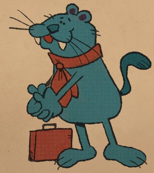
Pilanpo

pilanpo
More Posts from Quirinah and Others

return of the undead 🥀
blood ver:


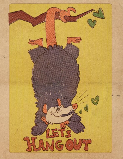
let’s laugh and go our separate ways
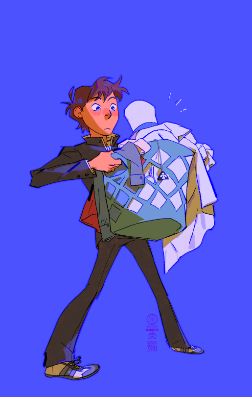
Something I try to keep in mind when making art that looks vintage is keeping a limited color pallette. Digital art gives you a very wide, Crisp scope of colors, whereas traditional art-- especially older traditional art-- had a very limited and sometimes dulled use of color.
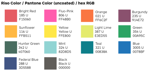
This is a modern riso ink swatch, but still you find a similar and limited selection of colors to mix with. (Mixing digitally as to emulate the layering of ink riso would be coloring on Multiply, and layering on top of eachother 👉)
If you find some old prints, take a closer look and see if you can tell what colors they used and which ones they layered... a lot of the time you'll find yellow as a base!
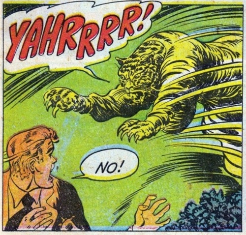
Misprints can really reveal what colors were used and where, I love misprints...
Something else I keep in the back of my mind is: how the human eye perceives color on paper vs. a screen. Ink and paint soaks into paper, it bleeds, stains, fades over time, smears, ect... the history of a piece can show in physical wear. What kind of history do you want to emulate? Misprinted? Stained? Kept as clean as possible, but unable to escape the bluing damages of the sun? It's one of my favorite things about making vintage art. Making it imperfect!
You can see the bleed, the wobble of the lines on the rug, the fading, the dirt... beautiful!!
Thinking in terms of traditional-method art while drawing digital can help open avenues to achieving that genuine, vintage look!


winter ayatakis…


(guy who waited until the last day of September to draw) i love kukuchi month ^_^


woe! nintama be upon ye
magic kaito is a very fun series
variant:
-
 gus-dix liked this · 3 months ago
 -
 edenalix liked this · 7 months ago
 -
 spock-adoodledoo reblogged this · 9 months ago
 -
 semisomnosres liked this · 11 months ago
 -
 lsd-ink liked this · 11 months ago
 -
 aksharonie liked this · 11 months ago
 -
 please-close-the-gate reblogged this · 11 months ago
 -
 valexanderr liked this · 11 months ago
 -
 varying-hues liked this · 11 months ago
 -
 flightlessribbons liked this · 11 months ago
 -
 sage-basil liked this · 11 months ago
 -
 question-of-violence liked this · 11 months ago
 -
 hot-cole-aid liked this · 11 months ago
 -
 artistically-unique-girl reblogged this · 11 months ago
 -
artistically-unique-girl liked this · 11 months ago
-
 floating-pisces reblogged this · 11 months ago
 -
 necromancin-lycanthrope liked this · 11 months ago
 -
 quirinah reblogged this · 11 months ago

|| Q || || ENG/中文 || calarts ca 28 || animator, character designer, yapper. a place to upload art logs/doodles.
239 posts